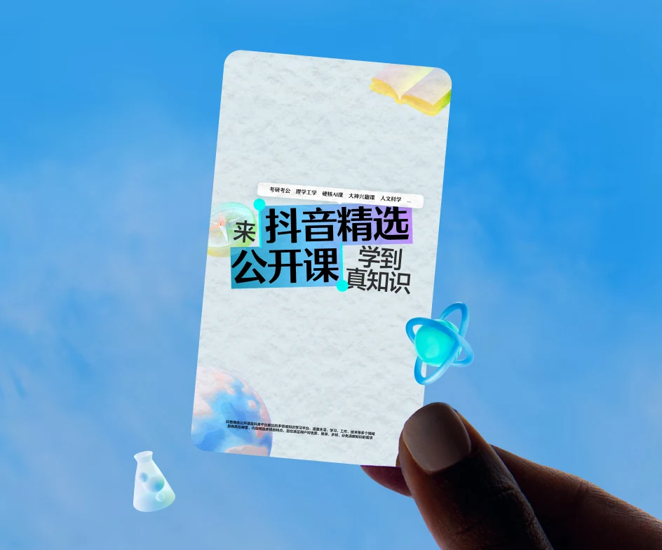
2025 / Passion in Every Frame
Douyin Jingxuan
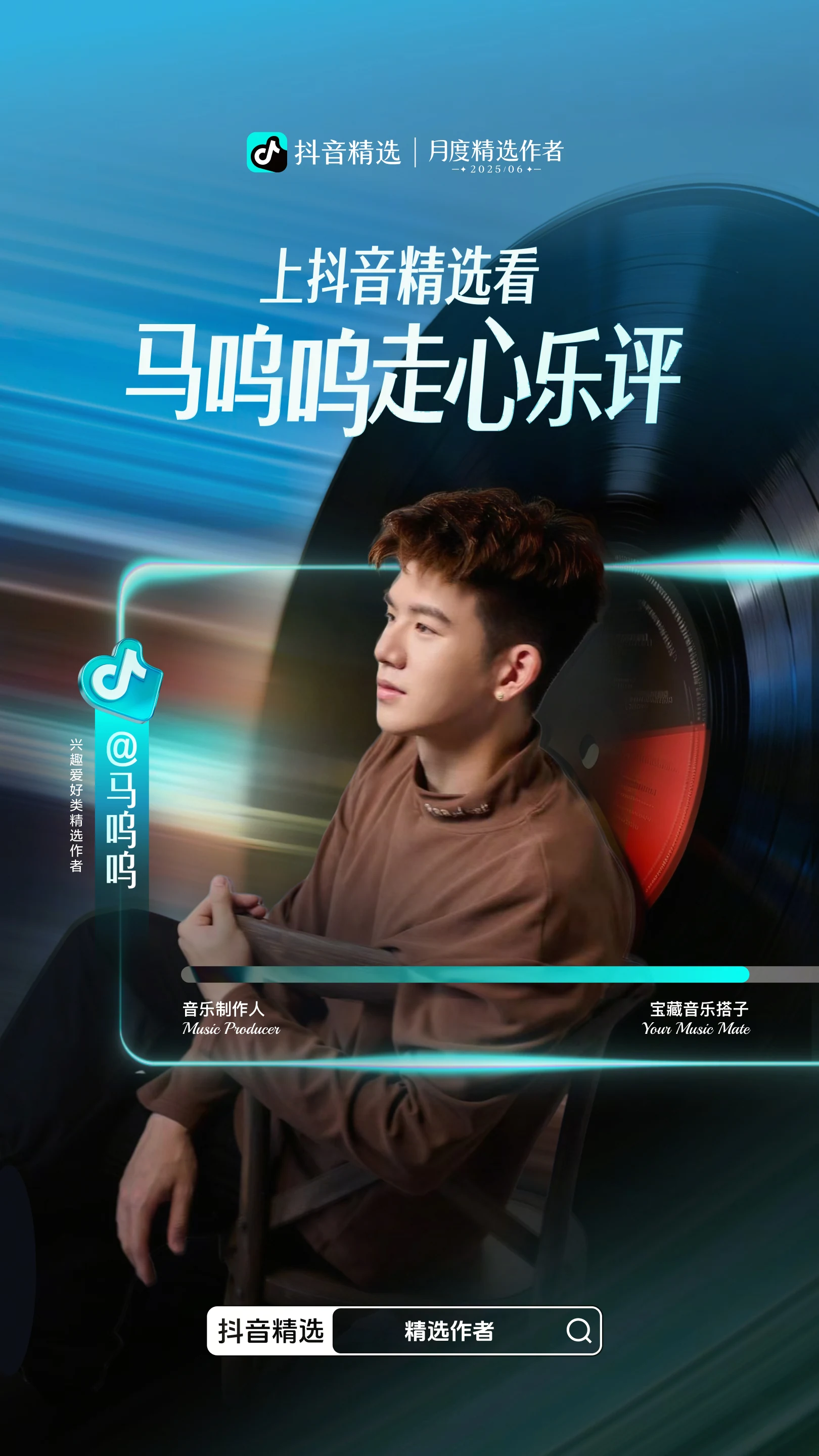

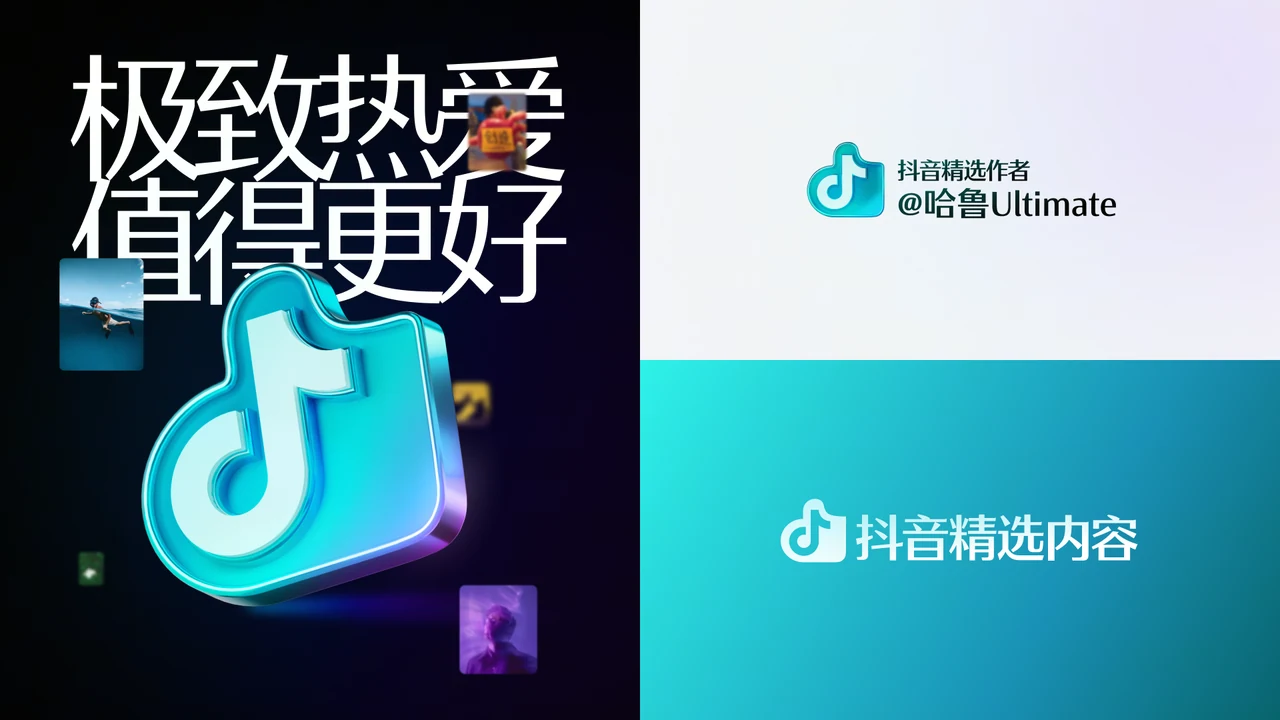
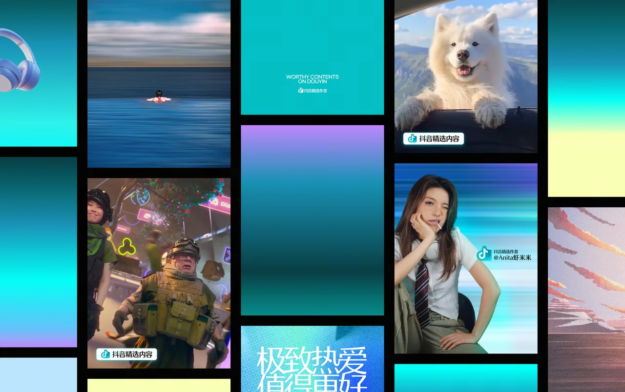
Douyin is home to vast amounts of high-quality content, but lacked a clear way to make that quality visible. This project transformed the defining qualities of great videos—light, movement, highlights, and craft—into a distinctive visual identity that helps valuable content stand out.
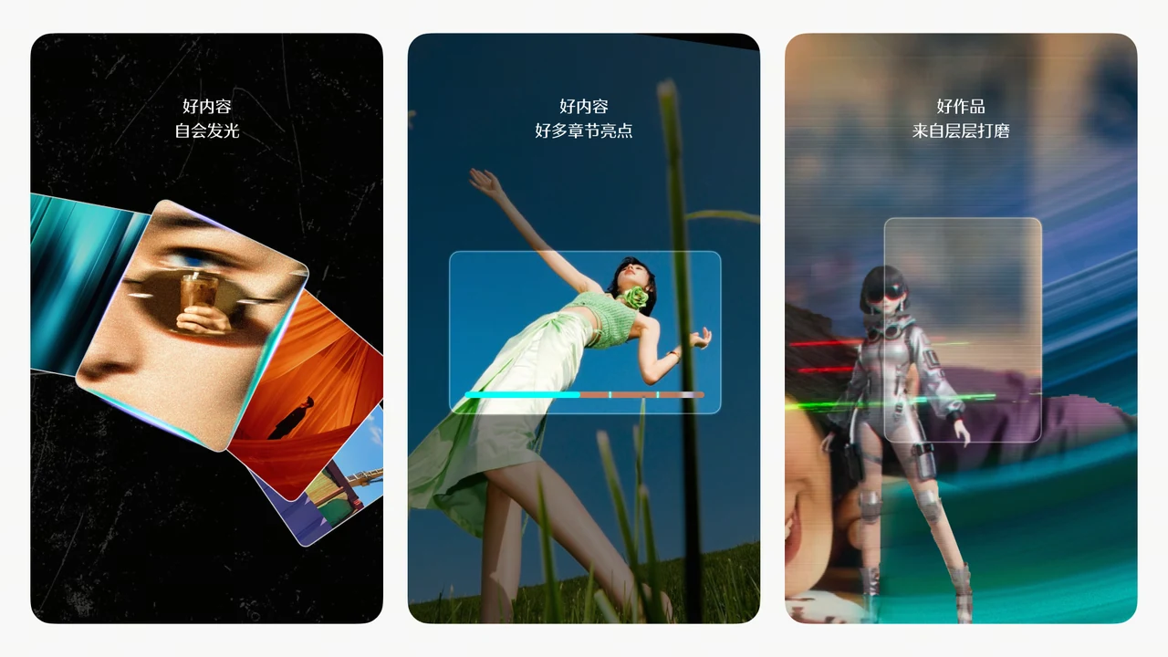

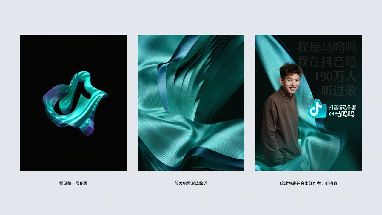
A Layered Approach to Visual Elevation
The upgraded visual system was constructed through four progressive layers: Background → Hero Content → Brand Endorsement → Video-inspired Details
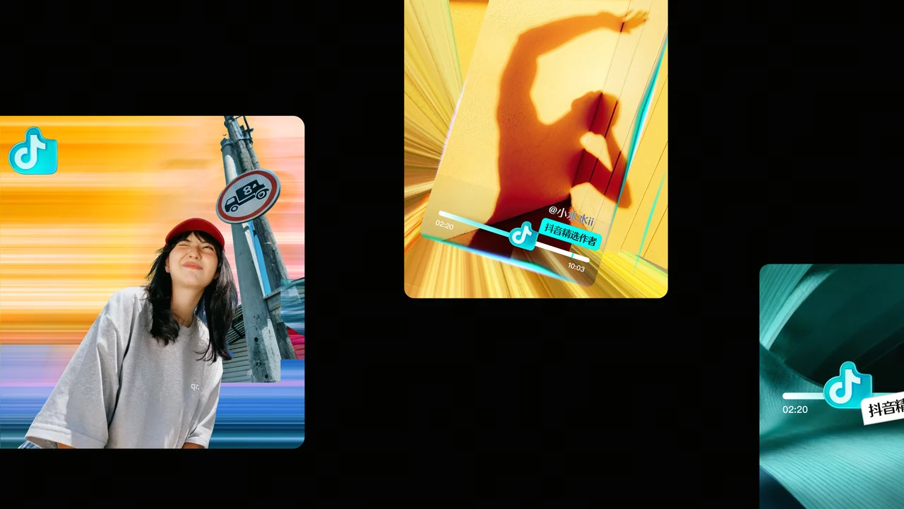
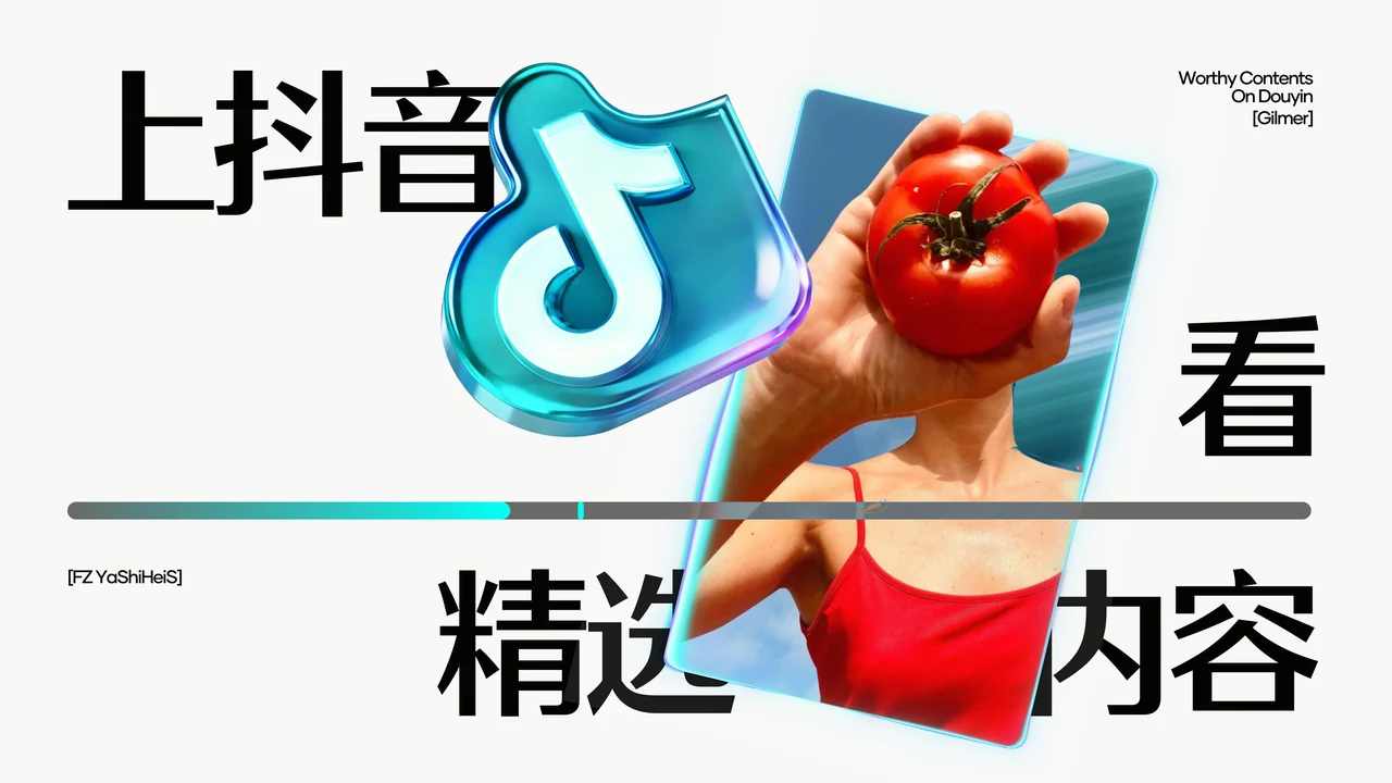
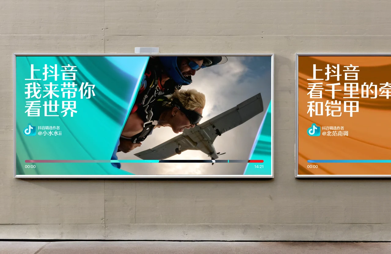
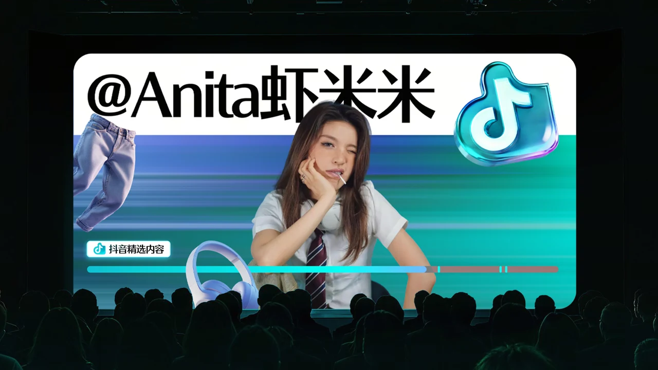
The visual system combines layered motion textures, light-led focal points, refined brand symbols, and progress-bar details to make content quality visible. Together, these elements create a distinctive and scalable identity that highlights the most valuable moments within each piece of content.
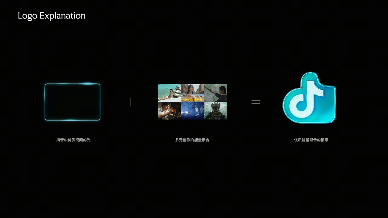
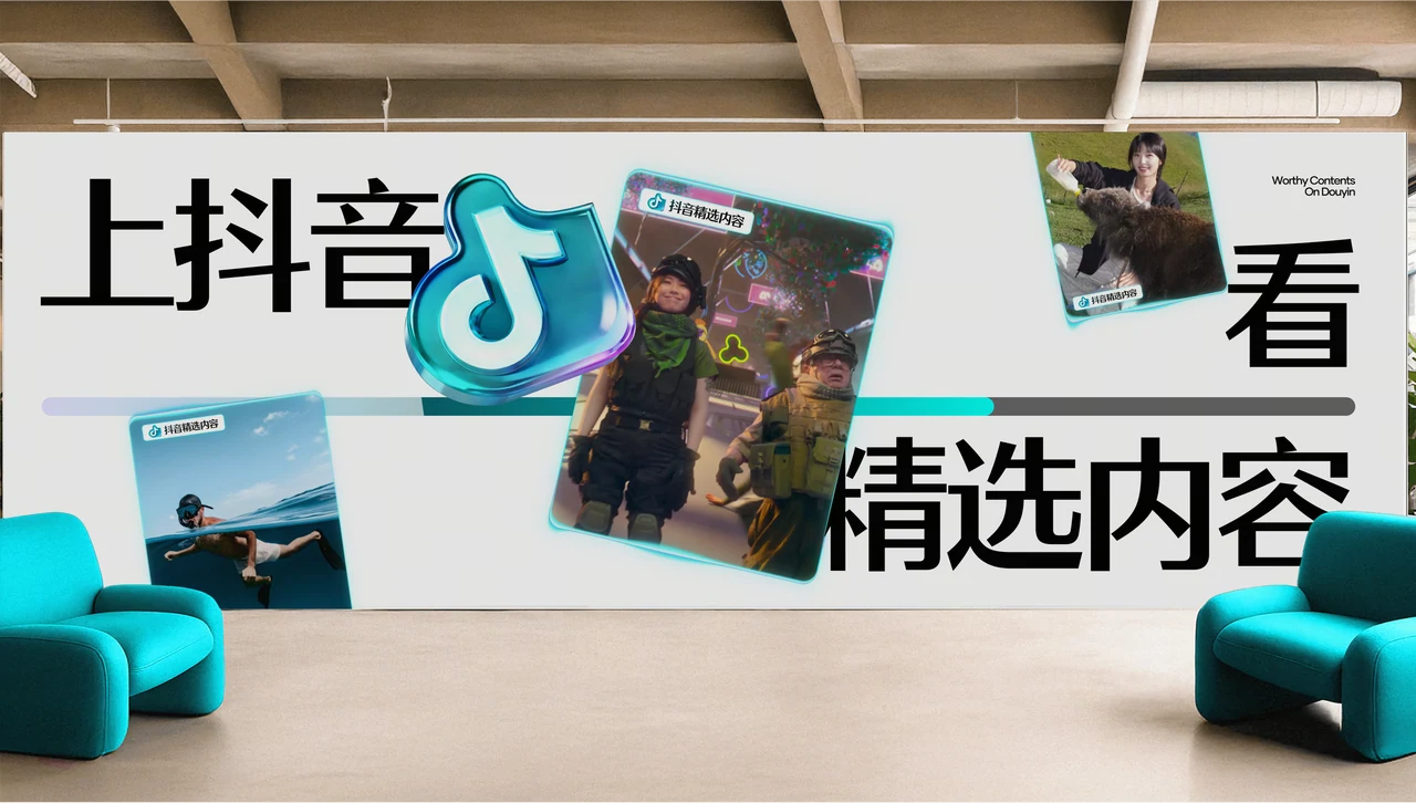
Brand System
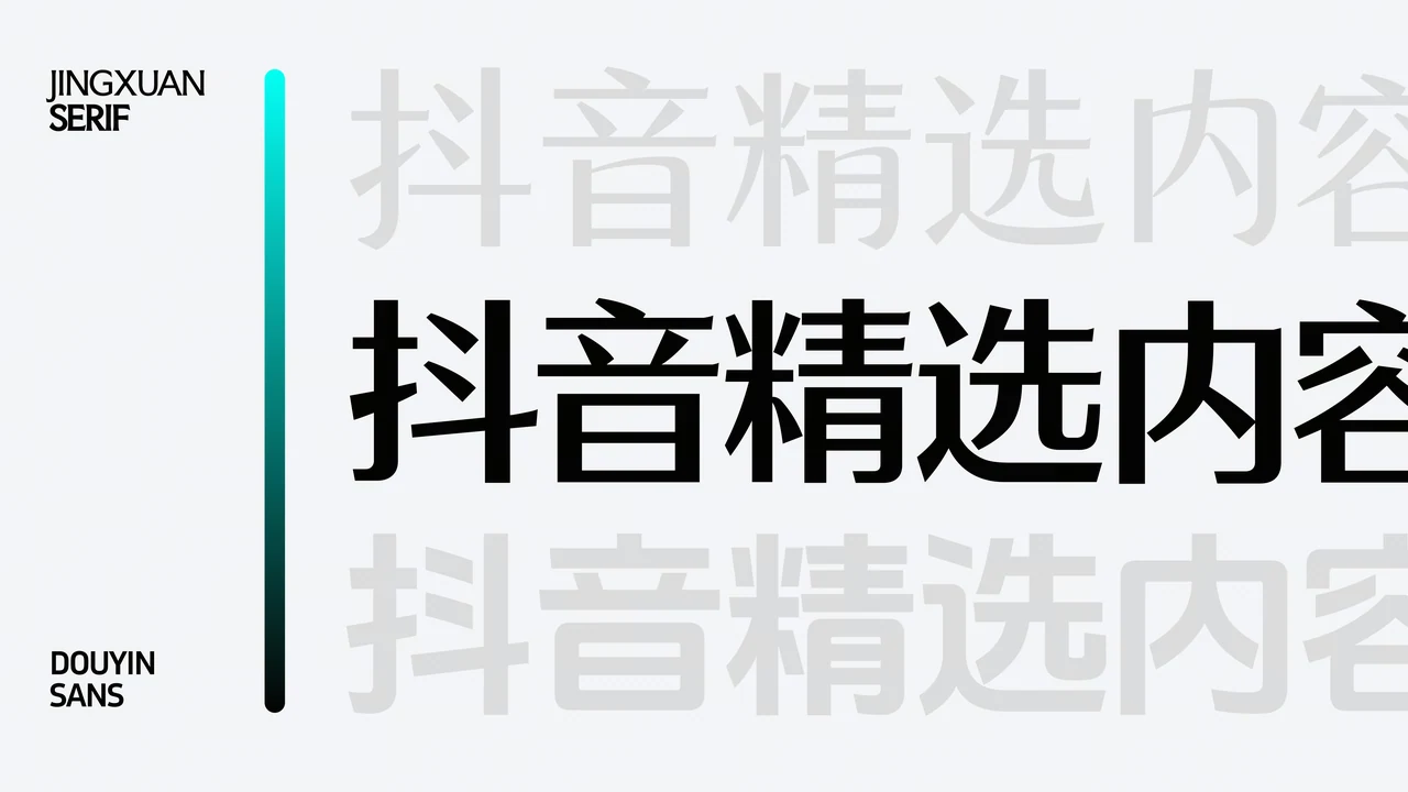
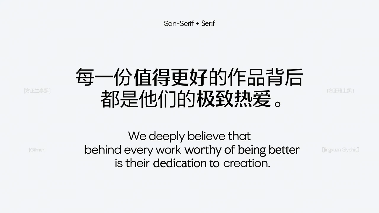
The brand system combines a structured grid with a custom typographic language derived from Douyin’s core typeface. Distinctive serif details and mixed-type compositions create a clear connection to the parent brand while giving Douyin Select a more refined and recognizable identity.
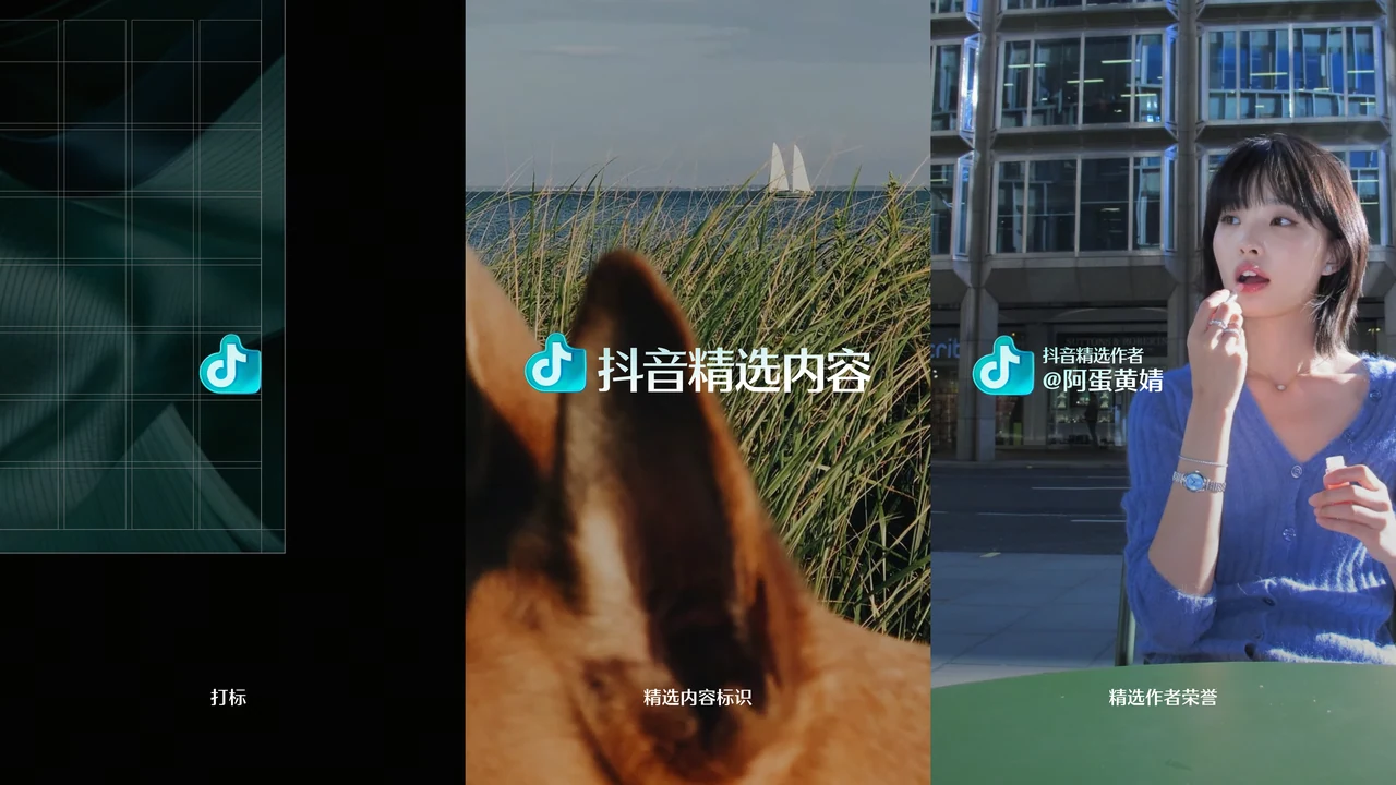


Brand Application
Clear ToB and ToC style guidelines translated the brand’s core idea—making quality visible—into consistent design principles, helping suppliers deliver more refined and recognizable outputs across touchpoints.